

Occasionally we are sent artwork that isn’t print-ready; the most common reason is that it is designed or sent in RGB. Now, I’m not against designing in RGB, but if you don’t know the difference between RGB and CMYK colours, you might be a little disappointed with the results.
The difference between RGB vs CMYK
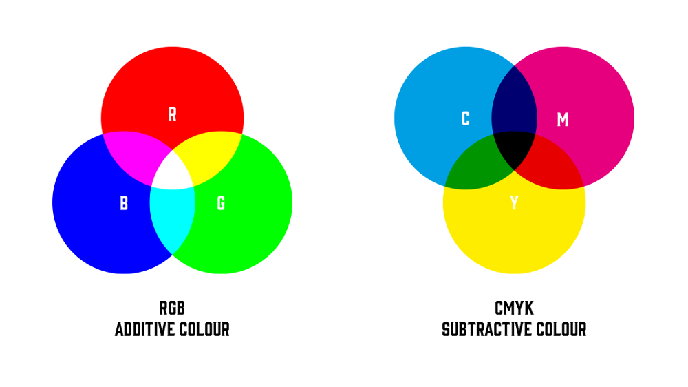
The problem is RGB (Red, Green, Blue) is made up of mixing light and CMYK (Cyan, Magenta, Yellow, Black) from mixing inks. They are different colour models used in different applications.
RGB can show off vivid colours, including glowing and bright lights, exceptionally well – think of your phone screen or TV, for example – because they are made of mixing coloured lights.
RGB is a colour model used primarily for electronic displays and digital media. It creates colours by mixing different intensities of red, green, and blue light. RGB has a wider colour gamut than CMYK, meaning it can produce a wider range of colours, making it well-suited for digital media with high colour accuracy. RGB applications include website design, digital photography, video editing and computer graphics.
CMYK, on the other hand, is a colour model used primarily for printing. It creates colours by mixing different amounts of cyan, magenta, yellow, and black ink. Because it is used in printing, it has a more limited colour gamut than RGB due to ink limitations. Examples of CMYK applications are print designs such as brochures, magazines, posters, and books.
Here are some pros and cons of RGB:
Pros:
- Wider colour gamut
- Better colour accuracy
- Suitable for digital media and electronic displays
Cons:
- Not suitable for printing*
And here are some pros and cons of CMYK:
Pros:
- Suitable for printing
- More cost-effective for large print runs – using the three primary colours and black is the least amount of colours you need to reproduce a full range of colours. You need more colours to reach a wider colour gamut, but more colours increase the cost. Some fine art prints use 6 to 12 inks to get closer to the RGB colour gamut, but this increases the costs drastically.
Cons:
- Limited colour gamut
- Not suitable for digital media and electronic displays
In summary, RGB is a colour model used primarily for electronic displays and digital media, which can produce a wider range of colours. At the same time, CMYK is a colour model mainly used for printing, which has a more limited colour gamut but is more cost effective for large print runs.
Why do we ask for CMYK Files?
When you save a file to CMYK, your computer usually tries to give you a representation of what it will look like, and it will usually appear slightly duller and flatter than its RGB counterpart.
That means you will have seen that version and approved the colours before sending it to us. There would be nothing worse than sending us an RGB file and expecting the colours to POP the same way.
*Some printing techniques may ask for an RGB file if they use more than a 4-ink process. These are usually for artist prints or limited edition runs.